

Last updated: 22/07/2026
The short answer
Mobile app accessibility is not a vague design preference — it is a short list of published numbers you can put in a scope document and test against. The reference standard is WCAG 2.2, a W3C Recommendation dated 12 December 2024, and its Level AA minimums are the ones most teams target: text contrast of at least 4.5:1 (3:1 for large text), at least 3:1 for the visual information that identifies user-interface components, pointer targets of at least 24×24 CSS pixels, and text that can be resized to 200 percent without losing content or functionality. On top of that, Apple and Google publish their own platform figures, and those are the ones your developers build to day to day.
Two practical points follow. First, none of this requires you to be technical: you can read the numbers, ask whether your app meets them, and expect an evidenced answer. Second, the commercial pressure has changed — Apple now shows Accessibility Nutrition Labels on App Store product pages, users can include those features in their search queries, and Apple states that over time sharing accessibility support details will be required to submit new apps and updates. Accessibility has moved from "nice to have" to "part of your store listing".
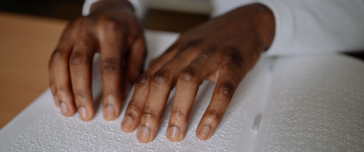
What "accessible" actually means in an app
An accessible app is one that a person can complete its common tasks in while using the assistive technology built into their phone — and that is a testable claim, not an abstract virtue. WCAG organises this into 13 guidelines under four principles: content must be perceivable, operable, understandable and robust. Each guideline has testable success criteria at three levels — A, AA and AAA — and conformance means meeting the criteria, not merely agreeing with the spirit of them.
WCAG is written for web content, which is why owners often assume it does not apply to a native iOS or Android app. W3C addresses that directly: WCAG "applies to dynamic content, multimedia, web on mobile, and AI web interfaces", and "can also be applied to non-web information and communications technologies (ICT) such as native apps, software, and documents, as described in WCAG2ICT". In practice this means WCAG is the vocabulary and the platforms supply the device-specific numbers.
The people this serves are not a niche. The World Health Organization estimates that 1.3 billion people experience significant disability — 16% of the world's population, or 1 in 6. And the same design choices help far more people than that figure suggests: larger text helps ageing eyes, higher contrast helps anyone using a phone outdoors, captions help anyone in a quiet office or a loud train, and a bigger tap target helps anyone holding a coffee in the other hand.
The numbers you can hold a build to
Here is the single most useful thing an owner can take away: the three organisations that matter all publish concrete minimums, and they broadly agree. The table below puts WCAG 2.2's Level AA criteria side by side with Apple's and Google's own published figures, so you can quote a number instead of asking for "good accessibility".
| What | WCAG 2.2 (Level AA) | Apple (iOS / iPadOS) | Google (Android) |
|---|---|---|---|
| Text contrast | At least 4.5:1; large-scale text at least 3:1 (SC 1.4.3) | HIG: "strive to meet color contrast minimum standards", citing WCAG and APCA | At least 4.5:1 for text under 18sp (or bold under 14sp); 3:1 for all other text |
| UI component contrast | At least 3:1 against adjacent colours (SC 1.4.11 Non-text Contrast) | Covered by the same HIG contrast guidance | Checked by Accessibility Scanner ("text and image contrast") |
| Target / control size | At least 24×24 CSS pixels, with a spacing exception (SC 2.5.8, new in 2.2) | 44×44 pt default control size; 28×28 pt minimum | At least 48dp×48dp — about 9mm physically |
| Spacing between targets | Undersized targets need a 24 CSS pixel diameter circle that does not intersect another target | About 12 points of padding around bezelled elements; about 24 points without a bezel | Targets "separated by 8dp of space or more" |
| Text scaling | Text resizes to 200 percent without loss of content or functionality (SC 1.4.4) | Dynamic Type: enlarge text by at least 200 percent (140% on watchOS); AX3 exceeds 200%, AX5 allows body text over 300% | Text sized in sp so it follows the user's font-size setting |
| Colour alone | Colour is not the only means of conveying information (SC 1.4.1, Level A) | "Differentiate Without Color Alone" is a named App Store label feature | Covered by Material accessibility guidance |
Read the target-size row carefully, because it is where the three sources differ most and where owners get confused. WCAG's 24×24 CSS pixels is a floor for pointer inputs generally; Apple's 44×44 pt is the default control size on iPhone and iPad with 28×28 pt as the stated minimum; Google's 48dp is a recommendation tied to a physical size of roughly 9mm, against a recommended range of 7–10mm for touchscreen objects. A team that builds to Apple's 44×44 pt and Google's 48dp comfortably clears WCAG's floor — which is the practical answer for a phone app.
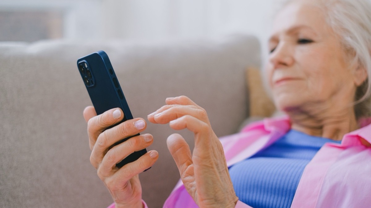
Apple's Accessibility Nutrition Labels
The single biggest change to app accessibility for a business owner is that it is now visible to buyers before they download. Apple's Accessibility Nutrition Labels "help users learn if an app will be accessible to them before they download", appear on the app product page, and cover nine named features. Apple is explicit about the direction of travel: providing them is "voluntary to start", but "over time, you'll be required to share accessibility support details to submit new apps and app updates to the App Store". Apple also notes that users can include these features in their search queries, which makes accessibility a discoverability question as well as an ethical one.
| Feature | What Apple says it means | Platform note |
|---|---|---|
| VoiceOver | Users can navigate and explore the app using gestures, keyboard, braille, and speech output. | Apple recommends evaluating this first |
| Voice Control | Users can navigate and interact with the app using their voice to tap, swipe, click, type, and more. | Not supported on Apple TV and Apple Watch |
| Larger Text | Increases the text size in the app to 200% or more. | Not supported on Mac |
| Dark Interface | Applies a dark colour scheme to the screens, menus, and controls to reduce eye strain. | — |
| Differentiate Without Color Alone | Uses shapes or text, in addition to or instead of colour, to distinguish key information. | Mirrors WCAG SC 1.4.1 |
| Sufficient Contrast | Increases or adjusts the contrast between text or iconography and background. | Mirrors WCAG SC 1.4.3 / 1.4.11 |
| Reduced Motion | Modifies or reduces certain types of animation that may cause motion sickness or discomfort. | — |
| Captions | Users can follow the dialog and relevant sounds of video or audio-only content with time-synchronized text. | — |
| Audio Descriptions | Users can hear audio descriptions of video content in a clip, show, or movie with time-synchronized narration. | — |
Two details are worth planning around. If you do not provide the information for a device, the section still appears on your product page and shows that you have not indicated support — silence is displayed, not hidden. And the labels render on devices running iOS 26, iPadOS 26, macOS 26, tvOS 26, visionOS 26 and watchOS 26 or later, so the audience seeing them grows with every OS upgrade cycle. Apple also lets you add an accessibility URL pointing at your own site to explain features, in-app settings, supported caption languages, and honestly, the areas your app does not yet support.
How accessibility actually gets tested
Accessibility is verified by a mix of automated scanning and hands-on testing with the assistive technology itself, and neither one alone is sufficient. Google is blunt about the limit of tooling: Accessibility Scanner "isn't a replacement for manual testing and doesn't guarantee the accessibility of the app". Apple frames its evaluation criteria the same way, recommending you start with VoiceOver because most of the work that makes an app usable with VoiceOver also helps users of Voice Control, Switch Control and Hover Text.
| Check | Platform | What it covers | What it cannot do |
|---|---|---|---|
| Accessibility Scanner | Android (9.0 and up) | Content labels, touch target size, clickable items, text and image contrast | Google states it is not a replacement for manual testing and does not guarantee accessibility |
| Espresso / Robolectric accessibility checks | Android | Automated accessibility checking inside your existing test suite | Catches mechanical issues only — not whether a task is actually completable |
| VoiceOver walkthrough | iOS, macOS, tvOS, visionOS, watchOS | Whether every common task can be completed without seeing the screen | Needs proficient testing — Apple notes accurate evaluation requires proficiency with VoiceOver |
| Larger Text walkthrough | iOS, tvOS, visionOS, watchOS | Truncation and overlap at the largest Dynamic Type sizes (AX3 and above) | Does not check labels, contrast or gesture alternatives |
| Contrast check | Both | Foreground/background ratios against the 4.5:1 and 3:1 thresholds | Cannot judge whether colour is the only cue being used |
The pattern to insist on is simple: automated checks run on every build so regressions get caught cheaply, and a human walkthrough with VoiceOver and the largest text setting runs before each release. If a vendor's accessibility answer is only "we ran the scanner", they have covered the mechanical half and skipped the half that determines whether a person can actually finish a booking.
When accessibility becomes a legal question
For a Singapore business the binding requirements today come from the platforms you distribute through and, if you sell into the European Union, from EU law — and this section is general information, not legal advice. The relevant instrument is the European Accessibility Act, Directive (EU) 2019/882. Its transposition article is unambiguous: Member States had to adopt the necessary laws "by 28 June 2022" and "shall apply those measures from 28 June 2025". Its scope article applies the directive to listed products placed on the market after 28 June 2025 and to listed services provided to consumers after that date — and the listed services include e-commerce.
What that means in practice for a Singapore company is a question of where your customers are, not where your office is. If your app sells goods or services to consumers in the EU, the EAA is a live consideration and worth putting to a qualified adviser in the relevant jurisdiction; if your audience is entirely domestic, your obligations run through Apple's and Google's requirements instead. There is one carve-out that matters a great deal to a startup or small business, and it is written into the directive itself: Article 4(5) states that "Microenterprises providing services shall be exempt from complying with the accessibility requirements referred to in paragraph 3 of this Article and any obligations relating to the compliance with those requirements." The directive defines a microenterprise in Article 3(23) as "an enterprise which employs fewer than 10 persons and which has an annual turnover not exceeding EUR 2 million or an annual balance sheet total not exceeding EUR 2 million". If that describes you and you are providing a service, the EAA's service obligations do not bite — though the exemption is narrower than it looks: it covers microenterprises providing services, while microenterprises dealing with products get lighter obligations rather than an exemption, and the thresholds are tested against the whole enterprise, not the app. Whether you fall inside it is exactly the sort of question to put to an adviser rather than to assume. We have deliberately not asserted any Singapore statute mandating private-sector app accessibility here, because we could not verify one — and an unverified legal claim is worse than no claim. Treat the platform requirements as the floor you must clear, and WCAG 2.2 Level AA as the standard worth writing into your contract.
There is also a plain commercial argument that needs no legislation behind it. The App Store now displays whether you support each of nine accessibility features, users can search on them, and the section appears on your product page whether or not you fill it in. Accessibility is becoming a visible product attribute in the same way that a privacy label is — and, like our note on app security and PDPA compliance, it is far cheaper to design in than to bolt on after a complaint.
What building it in costs
Accessibility costs very little when it is a design and QA decision and a great deal when it is a rebuild — which is the whole argument for raising it at scoping rather than after launch. Most of the work is not exotic engineering: choosing a colour palette that clears 4.5:1, sizing controls at 44×44 pt or 48dp from the first screen, labelling every icon button, letting layouts reflow at 200% text, and adding captions to any video you ship. Done at design time these are choices, not tasks. Done after launch they mean revisiting a palette, a component library and every screen that assumed a fixed text size.
At Namtech that work sits inside the normal build rather than as a separate invoice line. Our published tiers start at SGD 20,000 for a Starter / MVP, SGD 38,000 for a Business App and SGD 90,000 for an Enterprise / Platform build, with every project scoped individually — those are honest starting points, not teaser rates. After go-live, Maintenance & Support from 15% of build cost per year covers monitoring, OS updates, security patches and minor improvements, which is where accessibility regressions get caught as the OS and your app both change. Where an app carries heavier compliance requirements, we scope and quote that as a separate line item rather than burying it.
One honest caveat: we are not going to quote you a percentage-of-budget figure for "adding accessibility", because the real number depends entirely on how much of it was designed in from the start. An app scoped with the numbers in this article in its design brief absorbs the cost invisibly. An app that shipped with 2mm icon buttons and grey-on-grey text does not.
Questions to ask your vendor
- "Which WCAG level are we building to, and is it in the contract?" The expected answer is WCAG 2.2 Level AA. Anything vaguer than a named standard and level is not a commitment.
- "Do our controls meet 44×44 pt on iOS and 48dp on Android?" These are Apple's and Google's own published figures, so this is a yes/no question with evidence behind it, not a matter of taste.
- "Does the app still work at 200% text?" Ask for a screen recording at the largest Dynamic Type size. Truncated labels and overlapping buttons show up in seconds.
- "Have you completed a VoiceOver walkthrough of our main task?" Apple recommends starting evaluation with VoiceOver precisely because it surfaces the most issues; "we ran the automated scanner" is only half an answer.
- "Which Accessibility Nutrition Labels can we honestly claim?" The labels are self-declared against Apple's evaluation criteria, so the risk of over-claiming is yours. A vendor who talks you through which ones you cannot yet claim is the one telling you the truth.
How Namtech builds accessibility in
At Namtech accessibility is handled in the Design and Test phases of the build rather than as an optional extra you request later. Colour and type decisions are checked against the 4.5:1 and 3:1 contrast thresholds while the design system is being set, controls are sized to the platform figures from the first screen, and the QA pass before submission includes a run at the largest text size alongside the device testing we already do for a store submission. It is the same discipline described in our six-step build process: Discover, Design, Build, Test, Launch and Support.
After launch, accessibility keeps moving because the operating systems keep moving — new Dynamic Type behaviour, new label requirements, new OS versions your app has to keep up with. That is what maintenance is for, and it pairs naturally with the health and usage numbers we cover in measuring app success after launch. If you are scoping a build now, put WCAG 2.2 Level AA and the platform target sizes in the brief from day one — start from the tiers on our pricing page and book a scoping call.
Accessibility is not a subjective standard you can argue about — it is 4.5:1 contrast, 24×24 CSS pixel targets and text that survives 200% zoom, published by W3C, Apple and Google, and now printed on your App Store product page whether you fill it in or not.
Sources
- W3C — Web Content Accessibility Guidelines (WCAG) 2.2, W3C Recommendation 12 December 2024 (SC 1.4.1, 1.4.3, 1.4.4, 1.4.11, 2.5.8).
- W3C WAI — WCAG 2 Overview (13 guidelines, 4 principles, levels A/AA/AAA, WCAG2ICT and native apps).
- Apple — Human Interface Guidelines: Accessibility (control sizes, padding, Dynamic Type, contrast guidance). The HIG page renders its content from JavaScript, so the control-size table quoted above was read from Apple's own backing document endpoint, accessibility.json, which is the data that page displays.
- Apple — Overview of Accessibility Nutrition Labels (nine features, voluntary to start, OS 26 and later).
- Apple — Larger Text evaluation criteria and VoiceOver evaluation criteria.
- Google — Make apps more accessible (48dp×48dp touch targets, contrast thresholds by text size).
- Google — Touch target size (48dp, 8dp separation, ~9mm, 7–10mm range) and Accessibility Scanner.
- EUR-Lex — Directive (EU) 2019/882 (European Accessibility Act), Article 2 (scope), Article 3(23) (definition of "microenterprise"), Article 4(5) (microenterprises providing services exempt) and Article 31 (transposition by 28 June 2022, applied from 28 June 2025).
- WHO — Disability fact sheet (1.3 billion people, 16%, 1 in 6).
- Namtech — Pricing (SGD 20,000 / 38,000 / 90,000; Maintenance & Support from 15% of build cost per year).